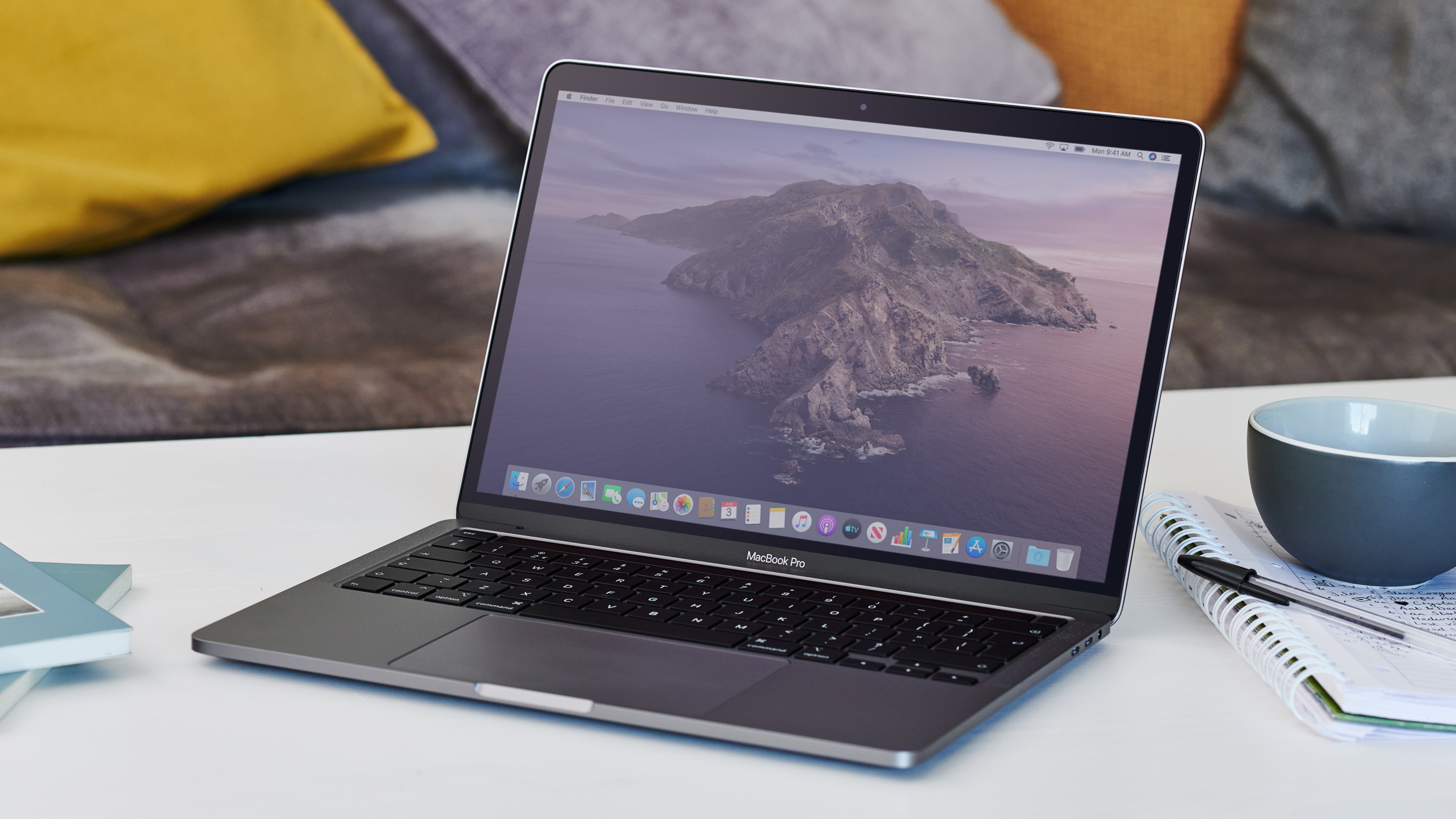
When most people think of Apple these days, products like the iPad, iPhone and Apple Watch are probably the first things that come to mind. That makes a lot of sense, through these mobile platforms, Apple, along with Google with its Android mobile operating system, has fundamentally changed the way people interact with technology on a daily basis.
While laptops aren't going anywhere, no matter how many weird commercials Apple releases asking what a computer is, there is definitely a lot to be said about finding ways of melding the user experience between these different devices.
That's been tried before – both with Windows 8 and ChromeOS – with mixed results in terms of usability. However, it's with macOS 11 Big Sur that Apple may have just cracked the code. This is due in part to the update's new design elements and Mac Catalyst, which will bring essentially every iOS and iPadOS app to Mac.

Trying to tear down the walls
When the iPad launched 10 years ago, I don't think anyone was expecting it to be as huge as it ended up being. I had a lot of friends who just laughed it off as a "watered down" computer, rather than something that would ignite a tablet revolution. And, to be clear, it definitely wasn't the first tablet, but you can't tell me the iPad wasn't what popularized the form factor.
A couple years later, Windows 8 was released, with its touch-friendly UI, doing away with the start menu that so many people have grown used to over the years. This was largely done to allow Windows tablets, phones and computers to all operate on the same platform, in theory boosting compatibility between the three.
However, Windows tablets never really took off in the same way as iOS or even Android tablets did. In practice, this meant that desktop users were stuck with an interface that was woefully inept for desktop usage. Microsoft eventually did alleviate some of this pain by reintroducing the start menu with Windows 8.1 and then Windows 10, but there are still a ton of people who yearn for the days of Windows 7 and Windows XP instead.
Just to give credit where it's due, Microsoft has made a lot of progress from where things were with Windows 8. However, in the interest of making Windows 10 touch-friendly, it's still not as desktop-friendly as Windows 7 or XP were. There is a wealth of mods and software out there to bring back older Windows interfaces back to Windows 10, and that should speak volumes to how much some users would like to get rid of the touch-friendliness altogether.
Ideally, Microsoft would make a touch-friendly interface optional, like a toggle somewhere in the settings that can enable or disable the tile interface in the new touch menu, without users having to scour the web for potentially harmful software. But, for the time being it seems like Windows 10 is stuck in this "is it touch or isn't it" limbo.

Sowing the seeds
When macOS 10.14 Mojave hit, bringing with it four iOS apps: Home, Apple News, Stocks and Voice Memos. None of these were particularly exciting, but it did give us a glimpse of what a unified – or more unified – Apple ecosystem could look like. Apple further expanded upon this with macOS 10.15 Catalina with Apple Catalyst, which gave Apple developers a full suite of tools to port mobile apps to macOS.
That is even further expanded with macOS 11 Big Sur, with Apple claiming that every iOS app will be compatible with your Mac, which is definitely huge. Add on to that the shift to Apple Silicon later this year, and there's a huge shift in the way Macs operate, even if functionally they'll serve the same purpose.
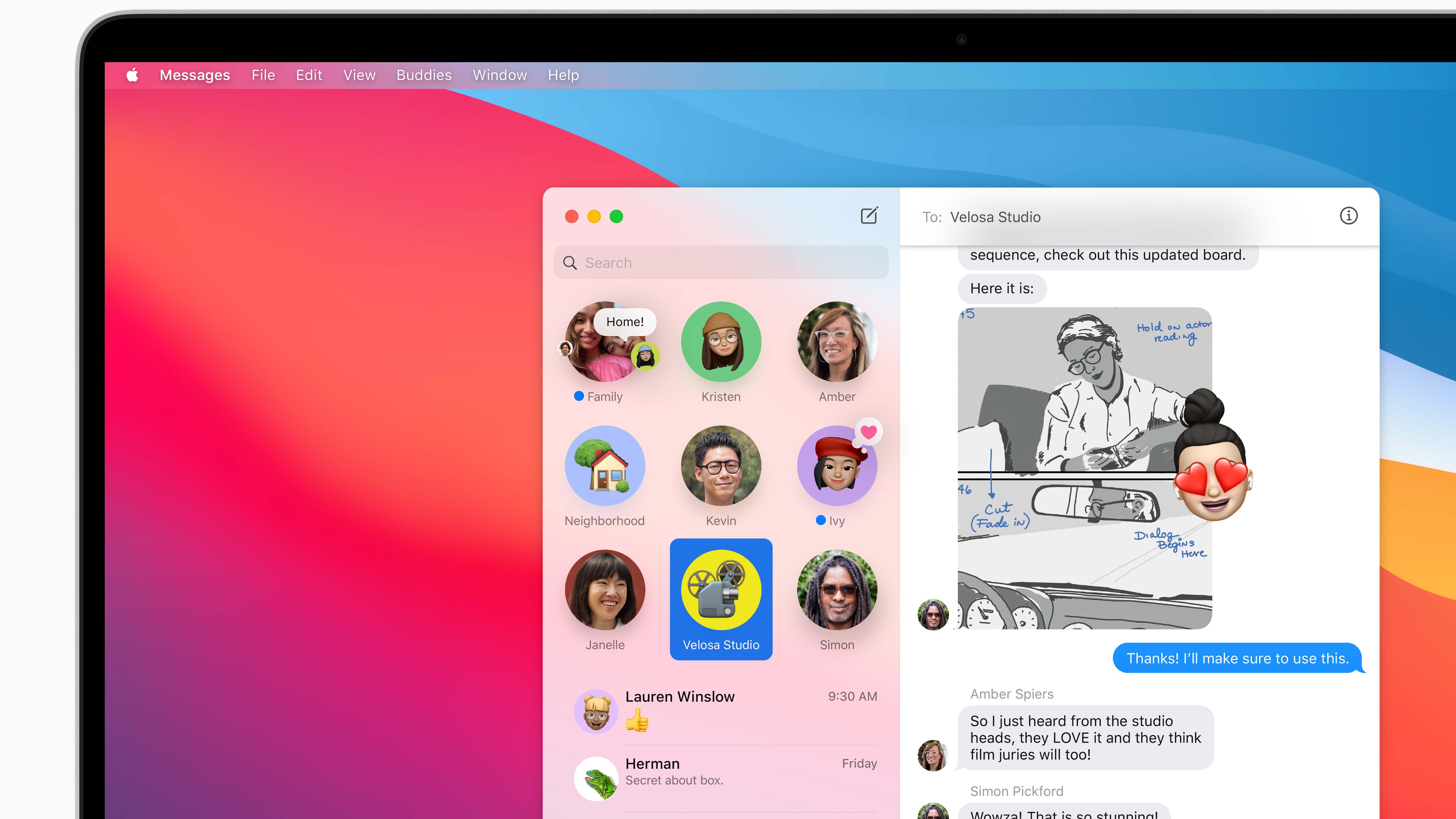
But it's more than just app compatibility here. The macOS Big Sur's UI brings in a ton of inspiration from the design philosophy of iOS. This could cause some concern for anyone having flashbacks to Windows 8's marriage of desktop and mobile design, but there's one thing to keep in mind: there still won't be touchscreen macs.

Mice can stay
Now this may be a hot take, but I think touchscreens are a tad overrated on Windows devices. Even after using hundreds of touchscreen laptops, none of them have really struck me as actually needing a touchscreen. There are certainly devices that are aimed at artists, however it seems that drawing tablets are typically still the way to go if you want to create art on your device – a cheaper solution, too.
Apple, however, still refuses to release a MacBook with a touchscreen, which means there is one core way to interact with a computer – and that's with a keyboard and mouse (or trackpad). What this means is that the UI is purpose-built around it, and there are no real growing pains.
So, when Apple brought over a lot of design cues from iOS, it's more like it took the iOS design of something like, say, Control Center, and twisted it to fit into a desktop setup.
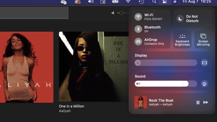
On macOS Big Sur, when you click to open up Control Center, it doesn't take up the entire screen like it does on your iPhone. Instead, you just get a small drop down menu that has a similar design, but doesn't take up too much space.
In the current Beta build, it's not the most useful menu in the world, but having a quick way to enable or disable Bluetooth, Wi-Fi, change volume and brightness is genuinely useful – especially if you're using a MacBook Air or a Mac desktop that doesn't have easy access to sliders like that through the Touch Bar.
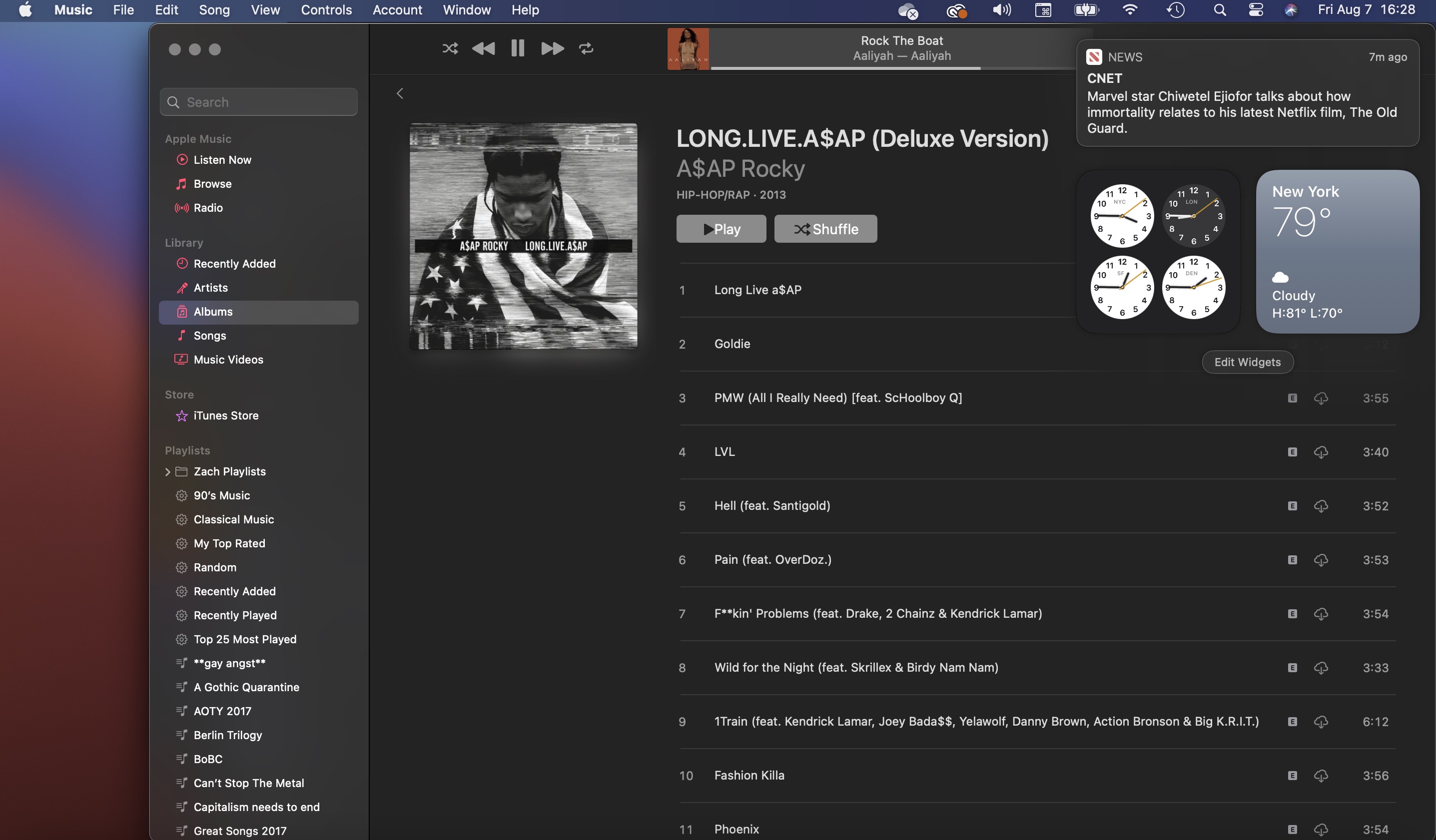
Plus having easy-to-use widgets that I can access anywhere by just swiping with two fingers to the left is extremely useful. Right now, the only widgets I have on that bar are the world clock – as I work with people all over the globe – and a weather app, so I can tell at a glance whether or not I'm going to melt in the New York sun as soon as I walk outside.
This is a very mobile phone-inspired feature, too, but again it's implemented in a way that doesn't interrupt whatever you're working on. The notification tray where the widgets live is transparent with Big Sur, which means they take up as little or as much of your screen as you want them to. This is huge when you're just checking the time when working on a photoshop project.
And, yeah, you can do the same thing on a Windows laptop. But don't even try telling me that Windows trackpads are anywhere near as responsive or gesture-friendly as a Mac trackpad. Apple has nailed the trackpad years ago, and no one has caught up – even if Dell and Razer are starting to get close.
The only real problem I have with either one so far is the lack of customization for the Control Center. My favorite thing about the feature on iOS is that I can add shortcuts to things like the Screen Recorder, the camera or a calculator. But again, we're still early in the macOS Big Sur Public Beta – so that can definitely change.

It's not here yet, but Apple kind of wins?
I have not by any means exhausted all the good stuff coming to macOS Big Sur, and there is definitely a lot. But throughout my time with the new operating system, I can't help but think of Windows 8.
I have had hot takes in the past defending Windows 8, and to this day I think that operating system is a bit too maligned. But Apple merged mobile and desktop design in an amazing way here, and I'm going to say it.
And I'm sure that Apple wants to sell you both a MacBook and an iPad for users that want that touchscreen experience, and a touchscreen MacBook would kind of defeat that. But, hey, that's a discussion for another day.
For right now, however, Apple deserves some praise for bringing this new design philosophy to macOS without falling to the same pitfalls that caused Windows 8 to become the joke it is today.
from TechRadar - All the latest technology news https://ift.tt/31wKwcL
via IFTTT
Subscribe by Email
Follow Updates Articles from This Blog via Email


No Comments